4+ years of experience crafting impactful, intuitive experiences that leverage design and technology to solve complex challenges. Building enterprise technology and design for millions of users around the world, one pixel at a time.
My work
Five projects that shaped enterprise systems, AI tools, and everyday experiences. ↓
Explorations in art & design
Following my interests where they lead…
It is essential for me to engage in the cross pollination of crafts, ideas, and people to constantly further my knowledge and perspective.
What keeps me inspired, sharp, and excited to create.
01Adventuring
Paragliding in Medellin, Colombia.
02Potato
My family’s rescue English Bulldog, Sweet Potato, brings me infinite joy and inspiration.
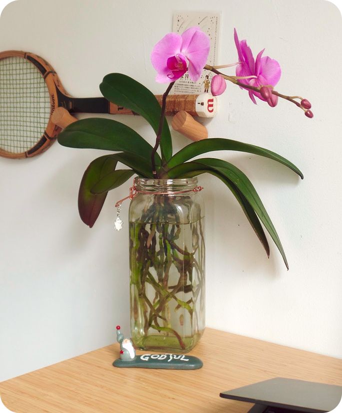
03Orchids
After 2 very patient years, my orchid has bloomed at last!
04Drawing
Drawing is a craft I have enjoyed since my mom gave me my first box of Crayola crayons.
Pioneer 11 Children’s Book
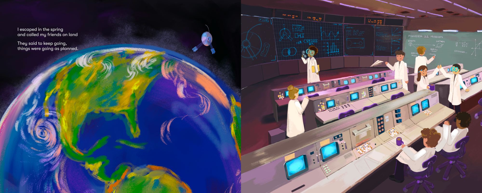
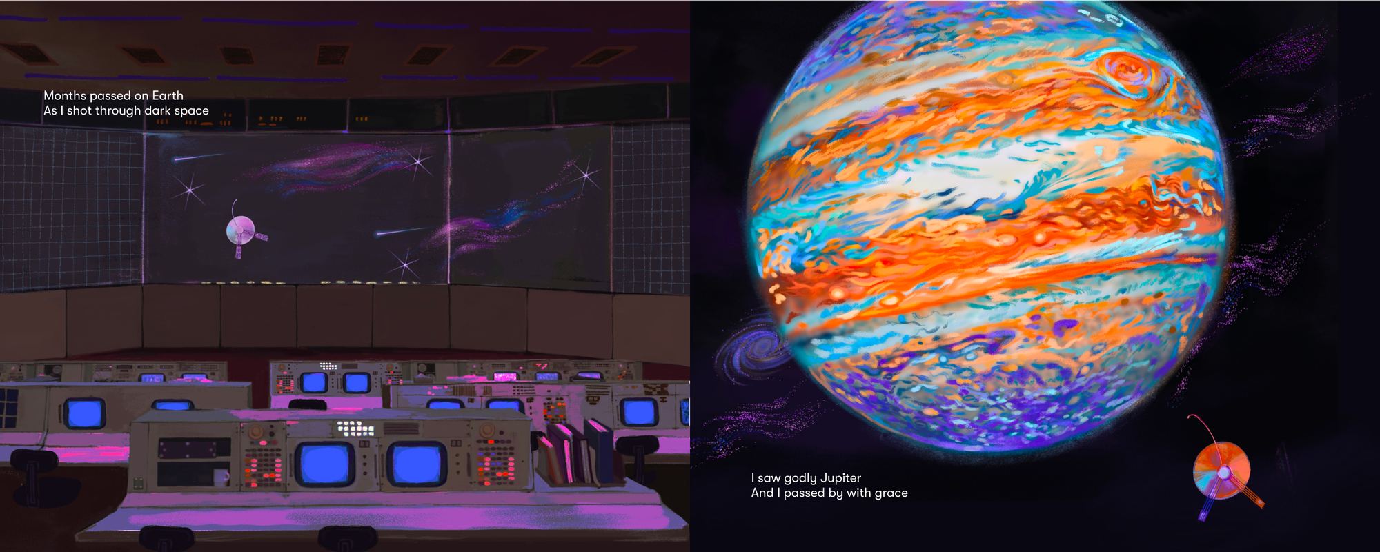
Collaborating with a writer, Linnea Foote, I illustrated her poem about the Pioneer 11 Space Probe to create a children’s book.
Executive Summary
Role: Illustrator
Team: Myself, Linnea Foote (Writer)
Timeline: 4 months
Primary Deliverable: 13 illustrated spreads
KPI: Children’s book draft
Background
The Pioneer 11 Story
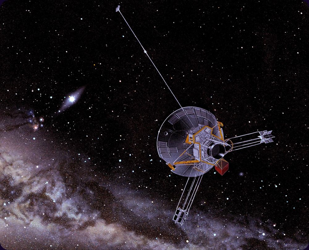
Launched by NASA in March 1972, Pioneer 11 was a robotic space probe designed to explore the outer solar system as a pathfinder for future planetary missions.
It became the first human-made object to achieve a close flyby of Saturn in September 1979, discovering new moons and rings while measuring the planet’s magnetosphere after using Jupiter’s immense gravity to swing itself across the solar system.
Carrying the iconic gold-anodized aluminum plaque inscribed with pictorial messages for potential extraterrestrial life, Pioneer 11 continued its trajectory toward interstellar space, eventually ending official communications with Earth in November 1995 as its radioisotope power source depleted.
The illustration was created by space artist Don Davis for NASA
Process
Melding the two mediums, poetry and illustration, was a very enjoyable part of this process. Success required harmoniously crafting a world and character that felt engaging and alive to draw in our audience.
WritingMy teammate focused on the stanzas, story structure, word choice, and rhyme scheme.
CollaboratingWe worked together to create a character, evoke a feeling, and design the journey for our reader.
IllustratingI focused on interpretation of the story, the settings, symbols, colors, and compositions.
Story Preview
The first draft is done and we couldn’t be more proud. As we figure out what to do next- here’s a preview of the story for you to enjoy.
Mythos: Greek Mythology Playing Cards
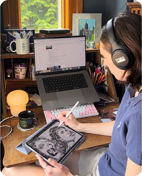
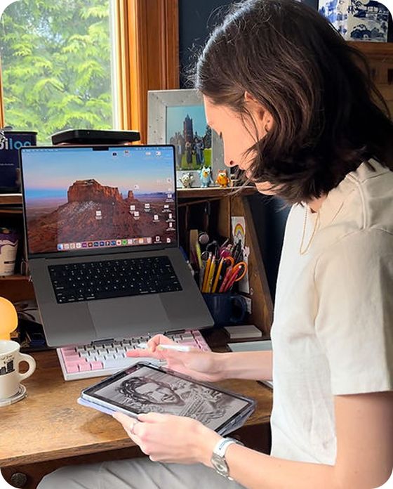
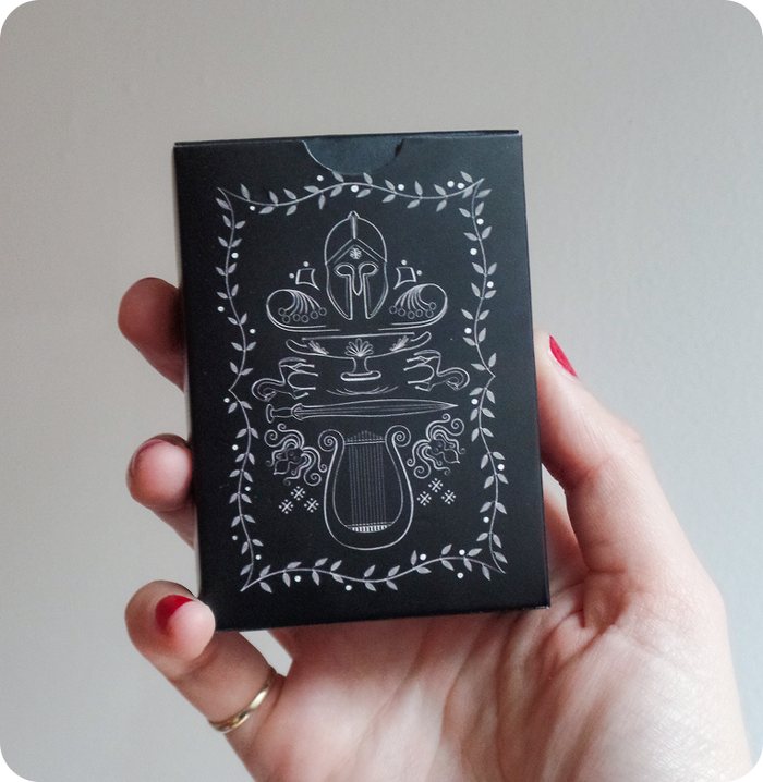
In 2023, I spent a good portion of my free time drawing my interpretation of Greek Mythological figures. Drawing after work everyday, during my lunch break and even once on the subway, I completed my self induced challenge and worked with a manufacturer to turn my idea into a physical product.
Executive Summary
Role: Illustrator
Team: Myself
Timeline: 14 months
Primary Deliverable: 52 portrait illustrations
KPI: An awesome hand made gift for friends and family members.
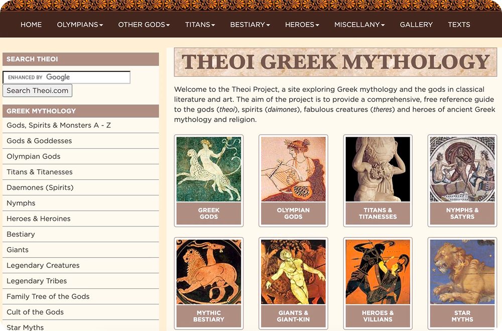
“The Theoi Project is the largest and most comprehensive reference website dedicated to Greek mythology and representations of mythological figures in ancient Greek art and literature.
It was created by Aaron J. Atsma from Auckland, New Zealand, with help from the libraries of the University of Auckland and Leiden University in the Netherlands. Established in 2000, the website contains more than 1,500 pages and 1,200 images.”
Drawing from thousands of characters, through exploration I identified both characters with familiar tales and those with stories that I felt people would be excited to hear.
02 Draw the Portraits
From my list I would select a character, learn their story, and find image references for how I imagined they may look. Each drawing took anywhere between 2 to 8 hours.
03 Design the Cards
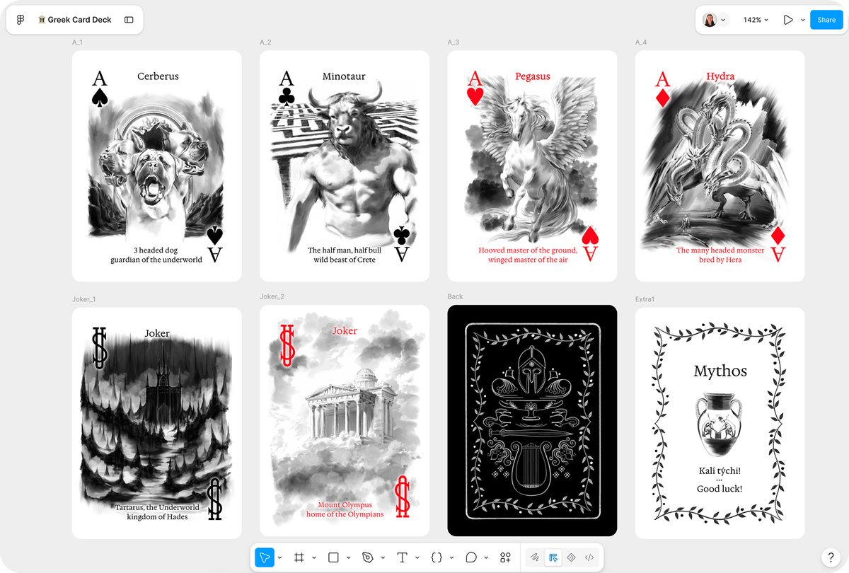
Using Figma, I was able to hold all of my high resolution illustrations and format them for production. This was one of the more challenging aspects of this process because while Figma handles graphics well it is not a print first design product.
04 Production
Partnering with a manufacturer based in Florida for round one printing and one in China for round 2, I experienced the process of proofing, paper selection, and packaging decisions.
Card Gallery
Explore the cards for yourself!
Press Shuffle to draw a card at random, or pick one below.
The Clubs
Select a card to learn more…
The Hearts
Select a card to learn more…
The Spades
Select a card to learn more…
The Diamonds
Select a card to learn more…
Mobiloo: Public Restrooms for Urban Environments
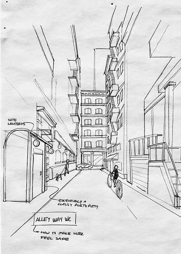
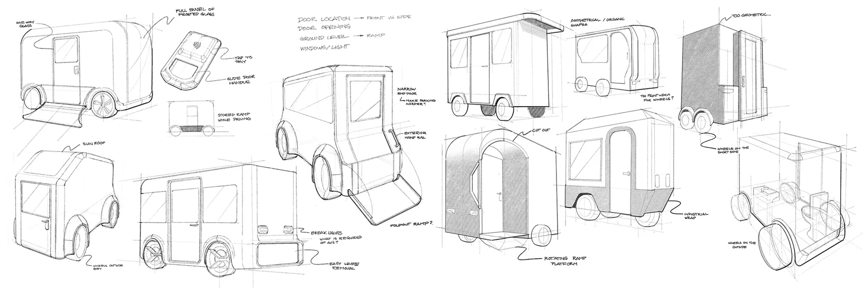
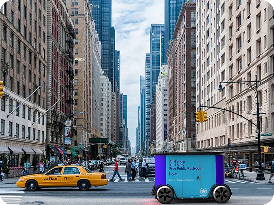
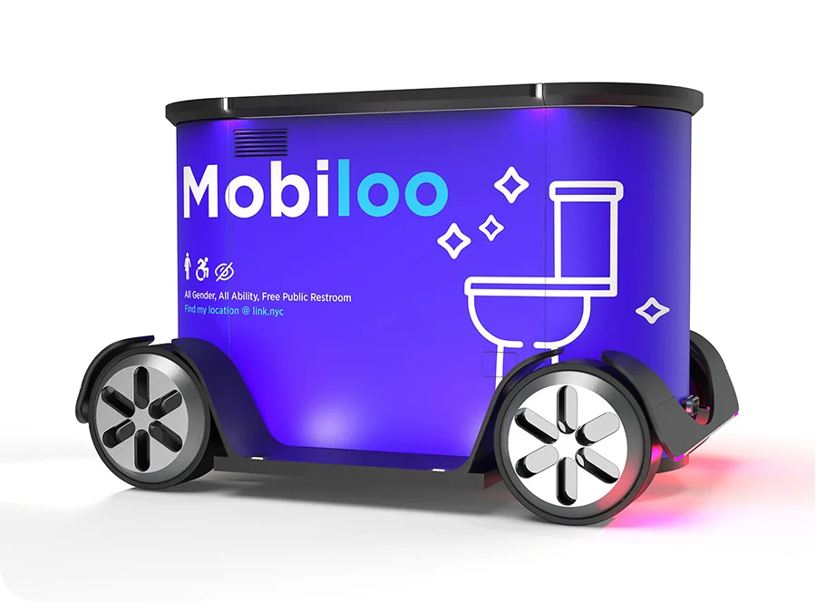
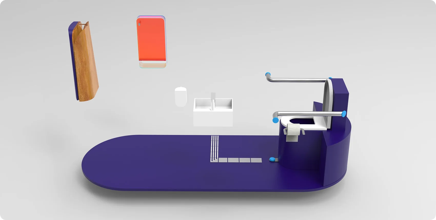
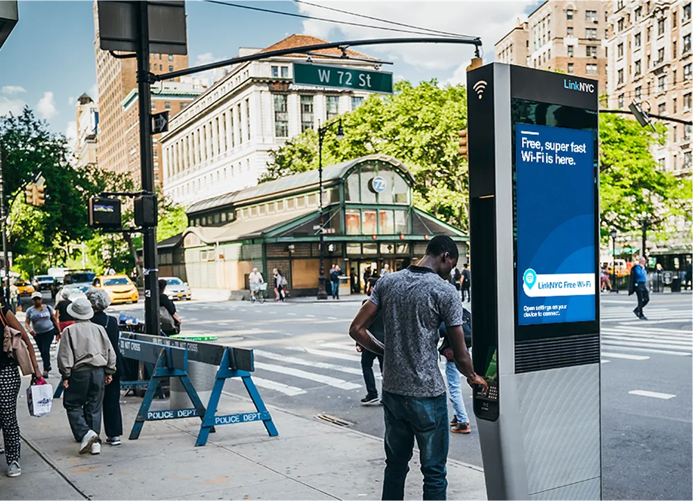
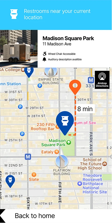
Mobiloo is a service design concept for New York City’s public restroom shortage: free, all-gender, all-ability restrooms on autonomous wheels, called from a phone or a street kiosk and parked at a curb near you.
Executive Summary
Role: Lead Product & Spatial Designer
Team: Solo Project, Syracuse University Design
Timeline: 12 months
Primary Deliverable: Service design concept
KPI: Solves a core crisis where 73.3% of surveyed New Yorkers report difficulty finding public restrooms
The Problem & Strategic Context
High Public NecessityUrban Accessibility CrisisSmart City Innovation
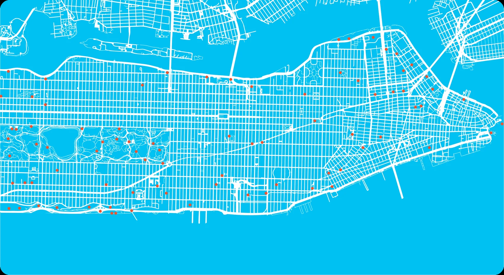
New York City faces a critical public infrastructure shortage: there are only a handful of public restrooms for millions of daily commuters, residents, and tourists. In user surveys, 70% of respondents highlighted the extreme difficulty of finding an accessible, clean restroom while navigating the city.
Existing public options are often out-of-service, unsafe, or geographically sparse, forcing citizens to rely on private business purchase policies. Leveraging autonomous mobile infrastructure provides scalable, flexible sanitation coverage without requiring permanent, high-cost real estate construction.
The NYC Bathroom Desertone public restroomData: NYC Parks Department, public restrooms map
Tap or hover anywhere on the map to see your walk to the nearest one.
Technical Constraints
Three constraints shaped every decision.
Spatial & Mobility LimitsNavigating dense Manhattan traffic and crowded sidewalks required balancing autonomous vehicle dimensions with internal accessibility requirements.
On-Demand vs. StationingBalancing active user calls via an app against static parking zones in high-density urban transit hubs.
Physical Hardware & UIDesigning both the digital touch points and the physical interaction flow (touchless entry, automatic sanitation cycles) within tight hardware constraints.
Exploration
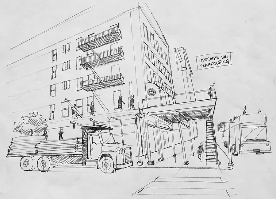
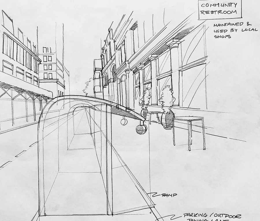
In a city so dense, where is there room?
On ScaffoldingIn between the sidewalk and the streetOn wider sidewalks
Distillation
Approximately 36% of Manhattan is covered in roads, perhaps there is room to spare…
Key UX Solutions
Four moments define the experience, from finding a unit to using it.
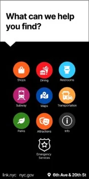
Mobile Kiosk RequestUsers can locate nearest stationary Mobiloo units or request an autonomous pod to a nearby designated curb drop point.
Real-Time Status & ETAClear visualization of arrival times, sanitation readiness, and occupancy status.
Contactless EntrySeamless unlock using digital passes or kiosk codes to ensure high hygiene standards.
Universal AccessibilityLayouts designed for physical accessibility, and resource accessibility with public kiosk.
System Architecture & Scalability
Service Ecosystem Integration
Connected user mobile app, street-level digital kiosks, and autonomous fleet routing logic.
Modular Spatial System
Standardized interior layout and sanitation modules for efficient maintenance, replenishment, and rapid fleet deployment across urban sectors.
Urban Infrastructure Signage & Kiosk UI
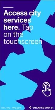
Consistent component library for digital signage displays, mapping interfaces, and mobile interaction states.
Teaching Gemini to build UI
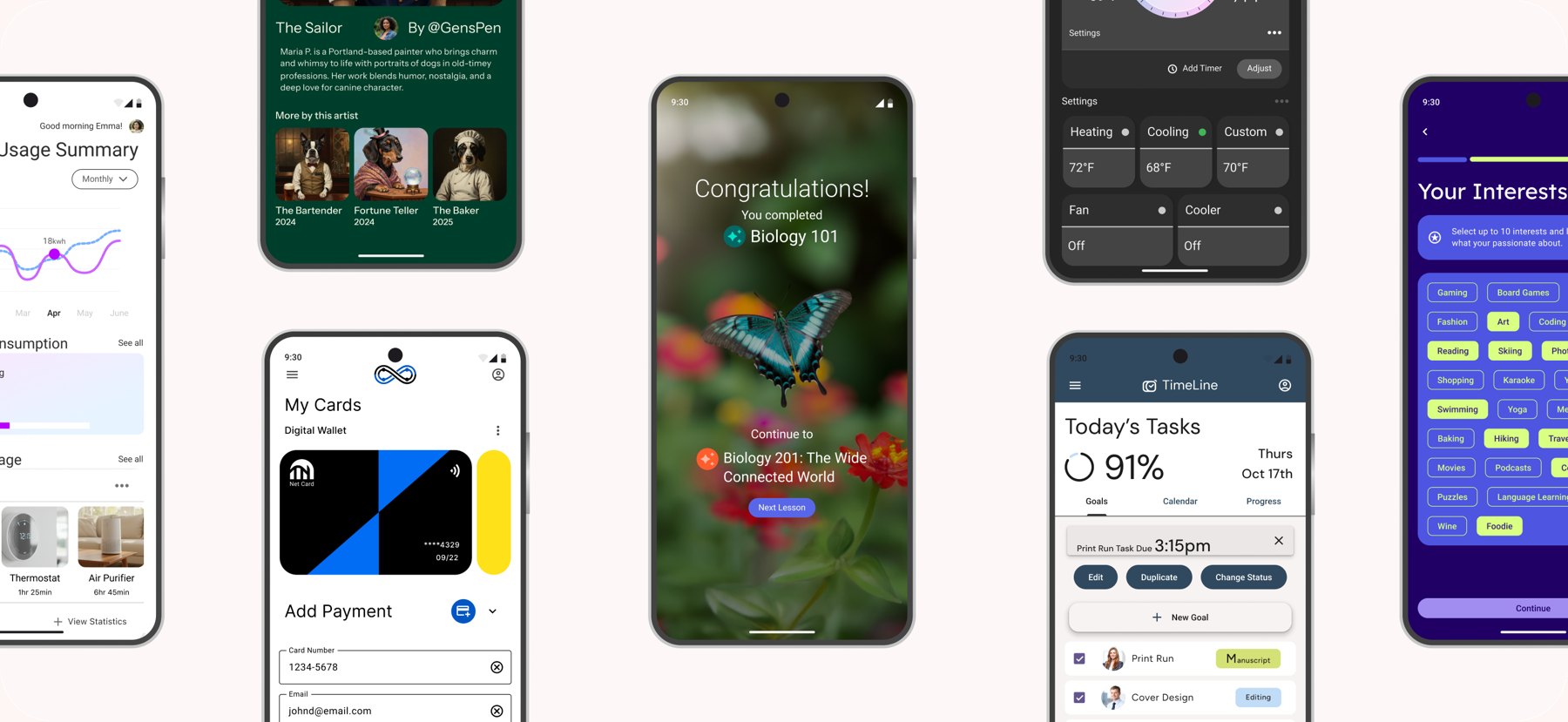
The Gemini team approached us to design and develop 13 unique apps each with their own design systems and package this as data sets to Android, to train their model to learn to generate code from UI.
Executive Summary
Role: Lead Designer
Team: IBM Consulting & Google Gemini Engineering
Timeline: 4 months
Primary Deliverable: 13 polished UI & Code data sets
KPI: With these datasets, the Google team was able to train their model to reduce UI dev time per screen by 90%
The Problem & Strategic Context
Pixel PerfectMLMClean ImplementationDesign Systems
To effectively train multimodal AI models to generate production-ready code from interface designs, existing datasets lack the strict pixel-to-code fidelity required for reinforcement learning.
That’s where we came in.
Traditional UI design prioritizes aesthetic appeals for human end-users, but training Google’s Gemini model required shifting the design paradigm toward an artificial consumer: the machine learning model itself.
The client needed us to create a “gold standard” ground truth to accurately parse interface intent into clean implementation. Addressing this gap was urgent for the client team.
Delivering 13 distinct application ecosystems across custom design systems paired directly with exact production code allowed researchers to establish a precise mapping baseline between visual interfaces and document object models, unlocking reliable vision-to-code generative capabilities.
Technical Constraints
Depth and Breadth
In order to ensure scalability and robust data for Gemini’s model, we cast a wide net and identified key app categories that would afford distinct visual identities and varied experience requirements.
The client required us to use 2 design systems for variety across the data sets.
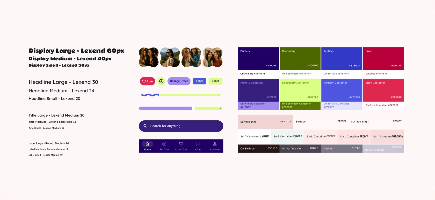
We used Google’s Material Theme Builder to create accessible unique styles, in which the tokens could be automatically packaged for developers.
My team decided Salesforce’s Lightning would be robust enough to take that second spot. It required the use of Tokens Studio, a plugin for Figma to generate component and style tokens for our Devs.
While this project was underway Google released the Material 3 design system. As an added value to our client we leveraged their latest DS for a data set.
Timeline
13 unique app types, each with 10 unique screen layouts, and a unique design system, collaboration and clarity were essential to pull off this delivery. We regularly met with our Google product lead, Paris Hsu, and our IBM dev team for a feedback loop.
One new app entered design every week while the earlier ones moved through review, development, and QA. Scroll sideways to see all 13 weeks.
Designed Solution
The packaged data set
10 screens Component Sticker Sheet Color Library Type Library Associated Code
Variation in components and styling
Every application ecosystem was built from a modular, tokens-driven sticker sheet—aligning typography scales, color roles, and layout primitives directly with strict CSS/Android styles so the ML model learns structural rules, not random pixels.
Variation in screen type
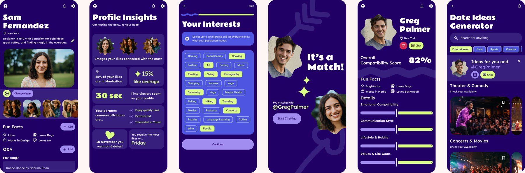
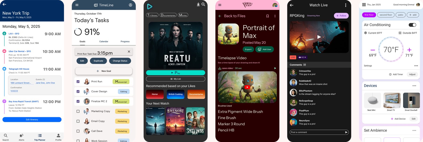
Designed diverse screen archetypes including profile dashboards, multi-step forms, match overlays, and data-dense views, forcing the vision model to generalize across complex spatial hierarchies and dynamic interaction patterns.
Variation in app type
Completed 13 distinct application domains ranging from IoT smart home controllers and travel itineraries to streaming video tools and productivity trackers ensuring the dataset prevents overfitting to a single visual style.
Shipped in ProductionIntegrated as a flagship Gemini feature in Android Studio Narwhal (3.0)
Workflow Efficiency90%+ time savings in initial UI prototyping by turning design assets directly into Jetpack Compose code layouts
Data Set UtilitySuccessfully trained the Gemini vision model to output deterministic, production-grade Jetpack Compose code with accurate component binding.
Key Learnings
Designing for Machine Learning Requires Strict Rules
Traditional UI design accommodates human visual interpretation, but training ML models demands strict, zero-ambiguity tokenization and explicit structural hierarchies.
Data set Integrity: Quality In, Quality Out
Edge cases, consistent component semantics, and pixel-to-code alignment directly correlate with the model’s accuracy when generating complex production layouts.
BofA Global Trade Finance
We redesigned CashPro Trade, Bank of America’s global trade finance platform, so corporate clients can move paper-heavy letters of credit through review and approval on both web and mobile. The result is one connected experience that cut document processing time by 40%.
Executive Summary
Role: Designer
Team: IBM Consulting & Bank of America Global Trade Finance
Timeline: 6 months
Primary Deliverable: End-to-end mobile and web portal redesign for CashPro Trade, Bank of America’s flagship global trade platform.
KPI: Reduced document processing time by 40%, streamlined mobile approval velocity for trade finance instruments, and achieved 95%+ design system compliance across trade modules.
The Problem & Strategic Context
Paper Heavy WorkflowsHigh Transaction FrictionBusiness Imperative Modernization
Corporate trade finance tools still rely on physical paper trails, complex manual compliance reviews, and fragmented legacy desktop tools. Executive sign-offs and trade document validations suffer from significant delays, directly impacting supply chain execution.
To retain multinational corporate accounts and drive digital adoption, Bank of America needed our help to modernize CashPro Trade into a cohesive, cross-device experience that enables secure mobile trade approvals and instant document capture.
Process Map
1. Agreement
The importer and exporter agree on a sale, and the importer’s bank issues a Letter of Credit to guarantee payment upon fulfillment of the terms. The exporter creates a Bill of Exchange.
2. Shipping
The exporter ships the goods and receives a paper Bill of Lading from the carrier as proof of shipment.
3. Presentation
The exporter presents the physical Bill of Lading and a Bill of Exchange (a formal demand for payment) to their bank to trigger the payment process.
4. Verification
The banks verify that all digital and physical documents match the Letter of Credit requirements exactly.
Constraints
Stakeholder Priorities Navigated:
Strict Trade Regulatory & Security StandardsWorkflows required multi-signature authorization, audibility, and international trade compliance protocols without adding friction to time-sensitive transactions.
Information Density on Mobile ScreensTranslating data heavy trade finance instruments (multi-party bills, financial clauses, and ledger entries) into clean, scannable layouts tailored for mobile devices.
Backend Integration LegacyDesigning intuitive frontend UI patterns while working around rigid legacy trade processing backends and fixed release schedules.
Users we heard from…
Letter of Credit ApplicantsTrade Ops AssociatesClient Servicing RepsBank Ops IssuersBofA Product LeadsBofA TechnologistsBofA Trade Origination
Key UX Solutions
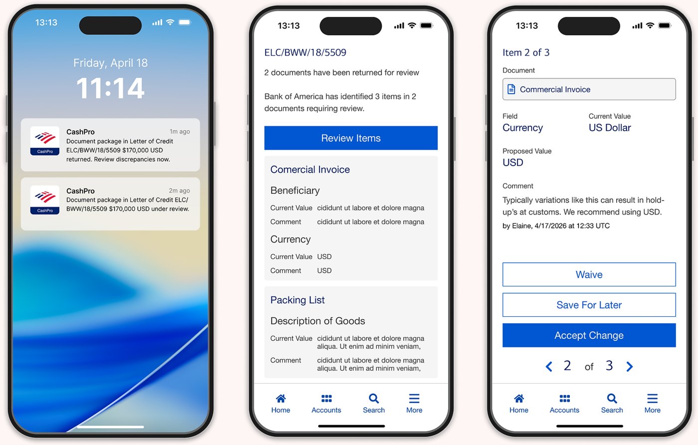
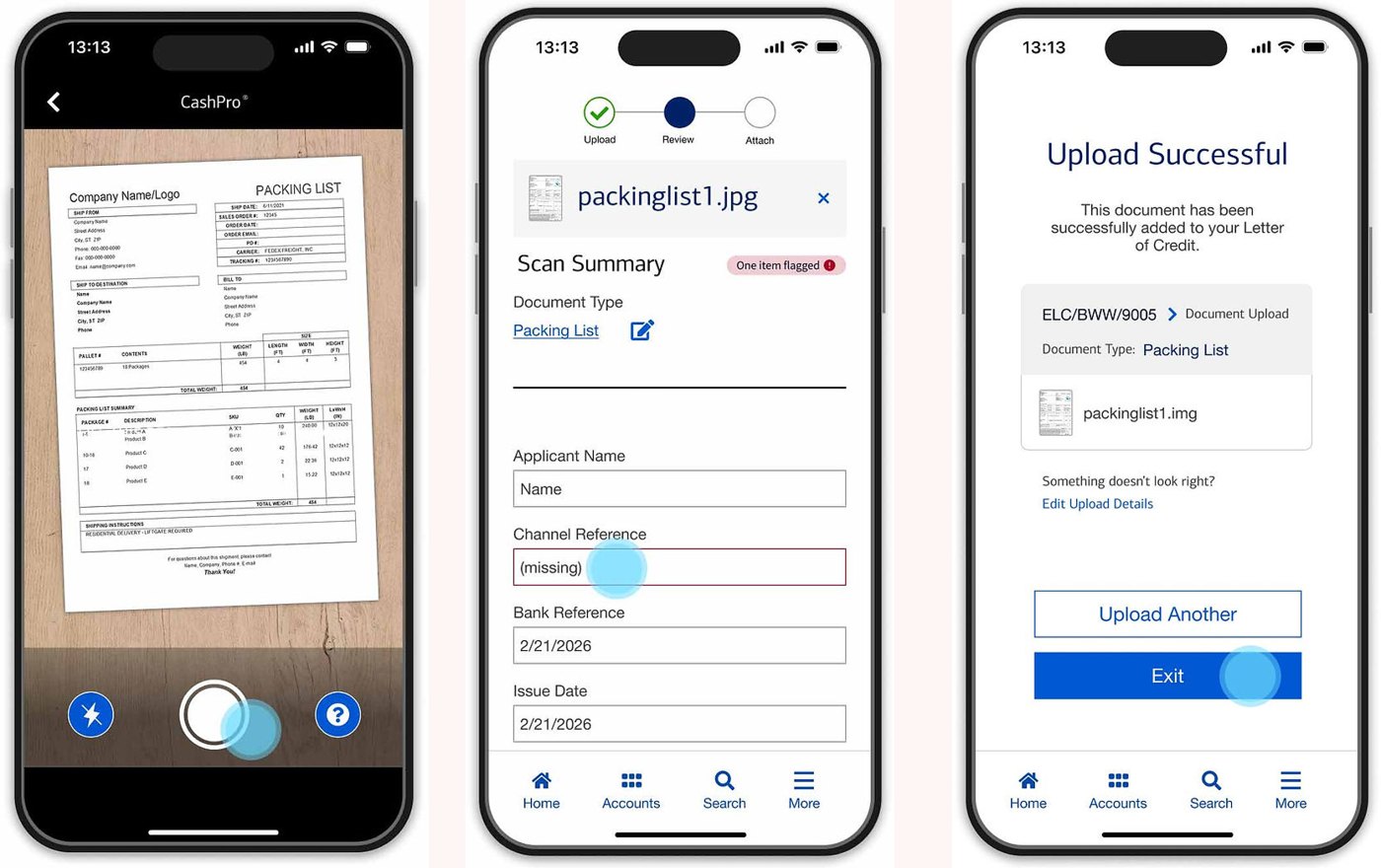
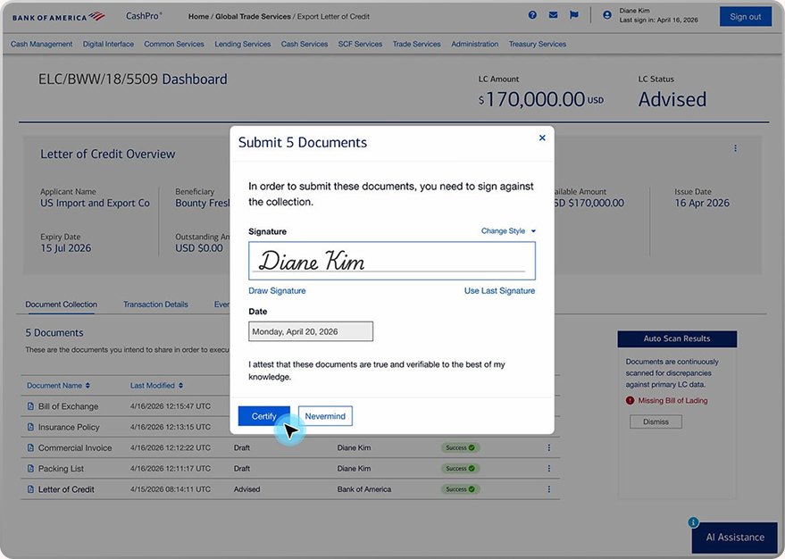
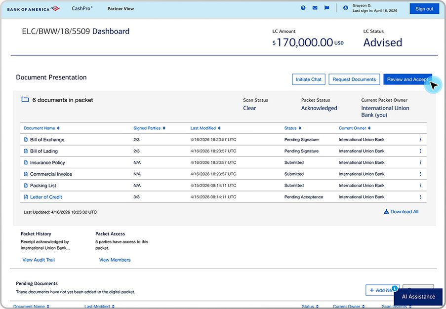
To bridge the gap between complex banking compliance and rapid execution, the redesigned CashPro Trade experience centers on four core UX transformations. By replacing fragmented legacy interfaces with responsive, step-by-step digital workflows, we transformed trade finance management from a paper-heavy desktop task into an intuitive, cross-device system. The following annotated flows highlight how targeted interaction decisions streamlined instrument applications, accelerated C-suite mobile sign-offs, and digitized document verification.
Next-Gen Mobile CashPro Trade Experience
Value Created
Dedicated mobile flows allowing executives to inspect trade requests, sign off on Letters of Credit, and track live application statuses on the go.
Challenge Solved
Users are experiencing delays due to holding patterns: document permission requirements, validation, global time zones etc. requiring computer access.
Mobile Document Scanning & Camera Capture
Value Created
Introduced an integrated document scanner with real-time edge detection and OCR alignment, allowing trade partners to upload physical trade paper and bills directly from their mobile devices.
Challenge Solved
The end to end process is extremely fragmented, with physical documents and digital documents, and files in emails and third party systems. Now documents can be digitized and live in one unified location.
Streamlined Trade Application & Issuance Portal
Value Created
The exporter can create a digital envelope it can be transferred directly to the importer by Bank of America. All of the documents in one location with clear ownership status.
Challenge Solved
Importers and exporters have their own third party systems that can’t work together, making communication, error resolution, and document transferring complicated.
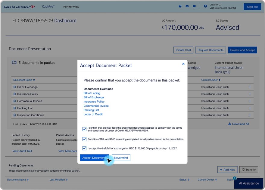
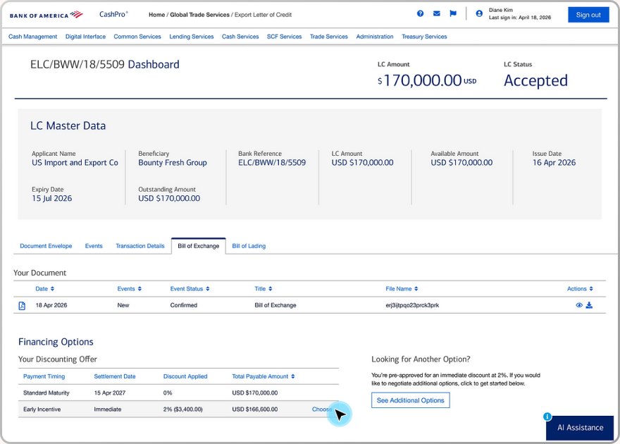
With Digital Acceptance, Collection can Happen Immediately
Value Created
When the transaction between exporter and importer is finalized, Bank of America can offer discounting for the exporter to collect immediately.
Challenge Solved
Exporters typically have to wait for payment from Importers, Bank of America would like to offer faster payment for a discounted rate. This is a significant revenue generation tool for Bank of America.
Measurable Outcomes
Key Metrics
Shipped in Production40% reduction in trade application processing time and increased mobile approval adoption among C-suite corporate treasury officers.
Workflow EfficiencyHigh satisfaction rates from corporate clients for mobile document capture efficiency and reduced error rates in trade filings.
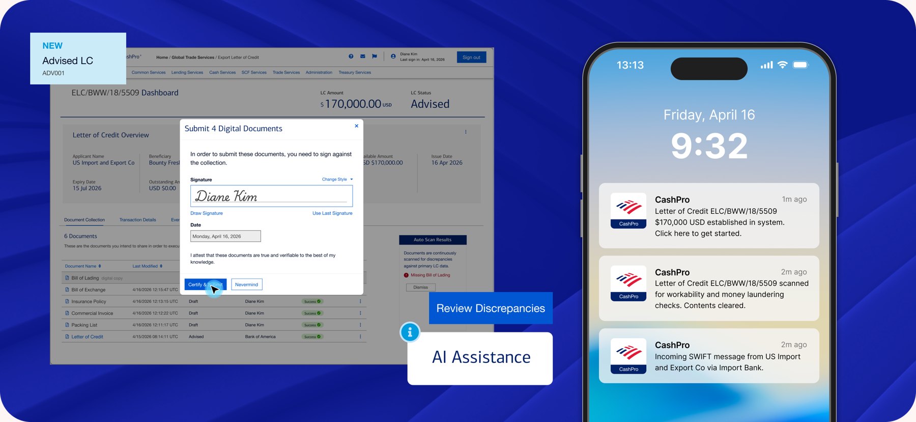
Future OpportunityExplore AI driven document pre-validation (automatic optical reading of bill of lading clauses) to flag discrepancies before submission.
Key Learnings
Understanding business goals and user requirements are essential for solving the right problem the right way. Our work directly supported the four pillars of growth identified by Bank of America for 2026. It also targeted user challenges from the source. Ensuring value for Bank of America and their clients.
User Needs
Faster TimelinesAutomated Data EntryMore VisibilityA Single Source of Truth
Business Needs
Digital Re-ImaginationSystem InteroperabilityNetwork ConnectivityScaling of Next Generation of SCF
Internal IT Help for Googlers
We merged Google’s two internal IT tools, My Tech and Techstop, into one portal where employees can manage devices, get software, and file support requests. Working with UX research, writing, and engineering, we made self-service the first stop so fewer issues turn into tickets.
Executive Summary
Role: Product Designer (Google Core UX xWF)
Team: Google UX Research, UX Writing, Design, Development, and IT Operations Leads, Arielle Royston (Google Designer), Swati Valecha (Google UX Designer)
Timeline: 6 months
Primary Deliverable: Consolidation of disparate internal enterprise IT portals (Techstop & MyTech) into a unified hub for global employee hardware, software, and IT support services.
KPI: Reduced internal support ticket resolution time, eliminated duplicate tool search overhead across global workforce teams, and standardized internal enterprise UI patterns.
The Problem & Strategic Context
Fragmented Internal ToolingOperational Inefficiencies & High OverheadBusiness Imperative Modernization
Google employees previously navigated siloed internal portals to request hardware, troubleshoot access, or file IT support tickets, creating confusion and lost productivity:
MyTechFor managing equipment, applications, cloud tops, and their security keys.TechstopFor managing all IT help requests
Scattered documentation and duplicated tool interfaces led to increased IT support ticket volume, redundant administrative overhead, and inconsistent user experiences across internal employee touch points.
Additionally Techstop would be adopting ServiceNow as its new back end vendor, which afforded new capabilities to be implemented.
Technical Constraints
Legacy Platform Migration
Merging distinct backend infrastructures and data models into one unified portal without interrupting daily IT support operations or service availability for internal users.
Diverse Employee Personas & Permission Scopes
Balancing high-level self-service features for standard employees with advanced administrative workflows for IT support technicians within the same unified system.
Tight Cross-Functional Alignment
Coordinating across UX Research, UX Writing, Brand/Illustration, and Engineering to maintain Google’s internal design standards while navigating competing functional priorities.
Teams we collaborated with
Google UX ResearchDiscovered the top 10 key user journeys (KUJs) and tested page layouts to ensure positive user adoption.
Google UX WritingAligned with the writing team to craft a voice to translate the intended experience.
Vendor IllustrationCollaborated with local design studio illustration team to create custom art for the page heroes.
Designed Solution
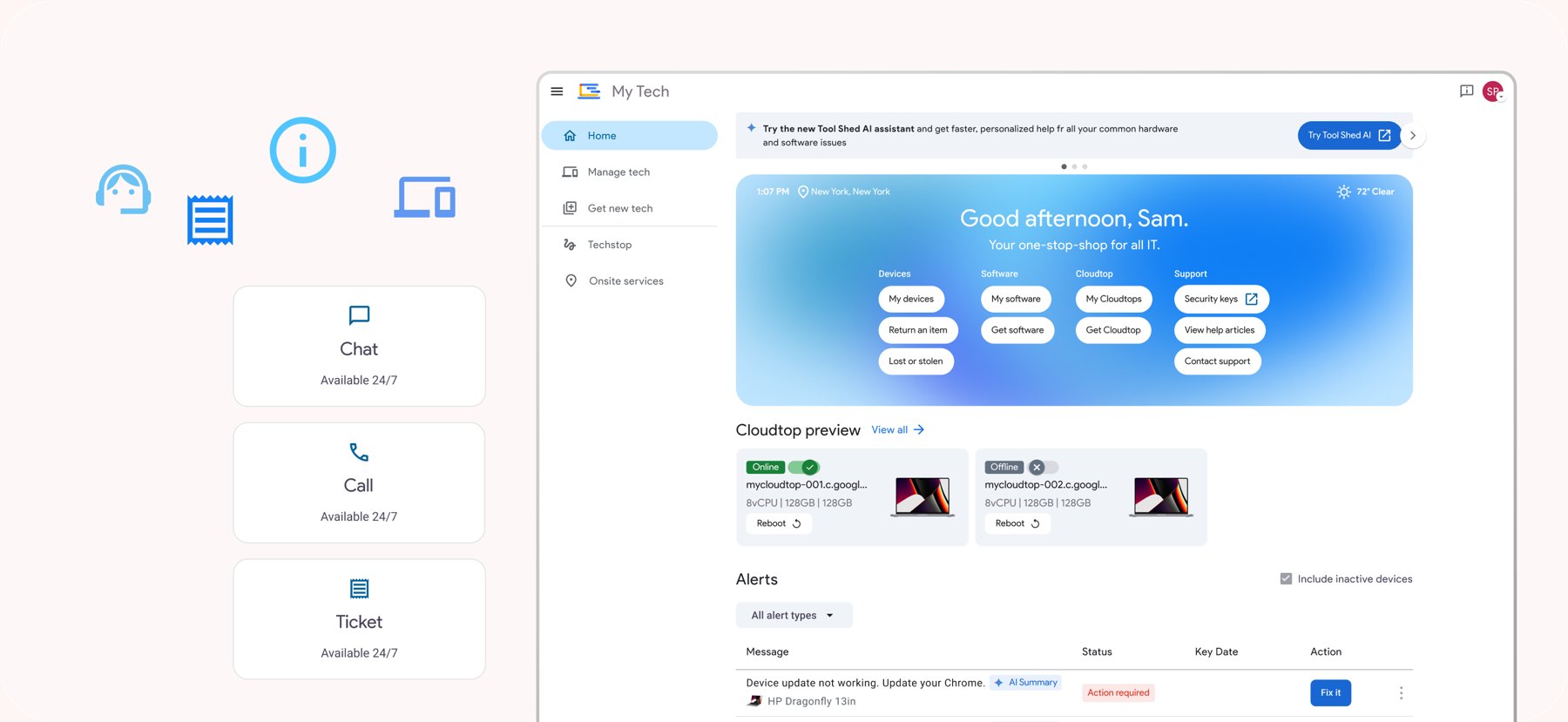
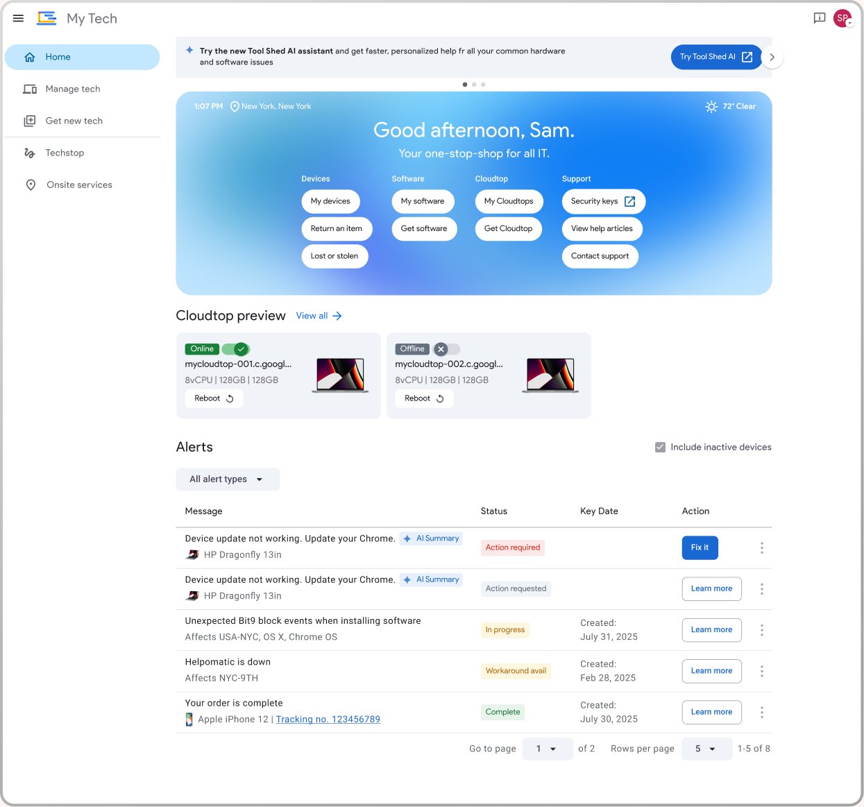
Unified MyTech Home & Service Portal
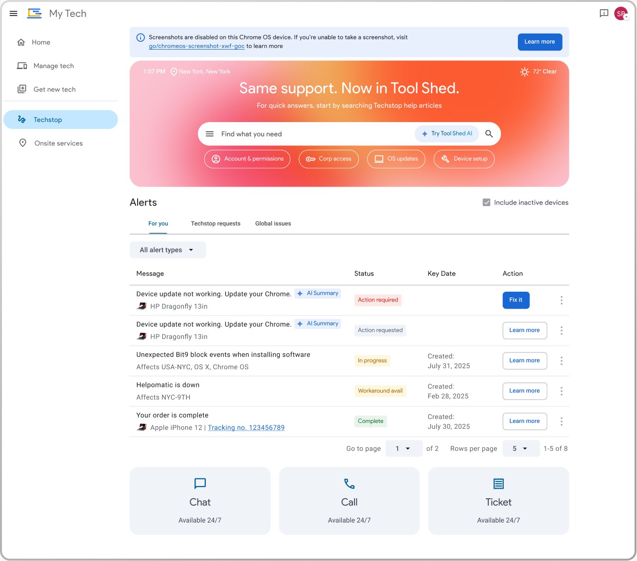
Designed a centralized dashboard architecture combining hardware provisioning, software management, and support resources into a single scannable landing page
Techstop Integrated Support Hub
Re-architected ticket creation and live troubleshooting flows supported by ServiceNow capabilities with proactive self-service suggestions to resolve common IT issues before submission.
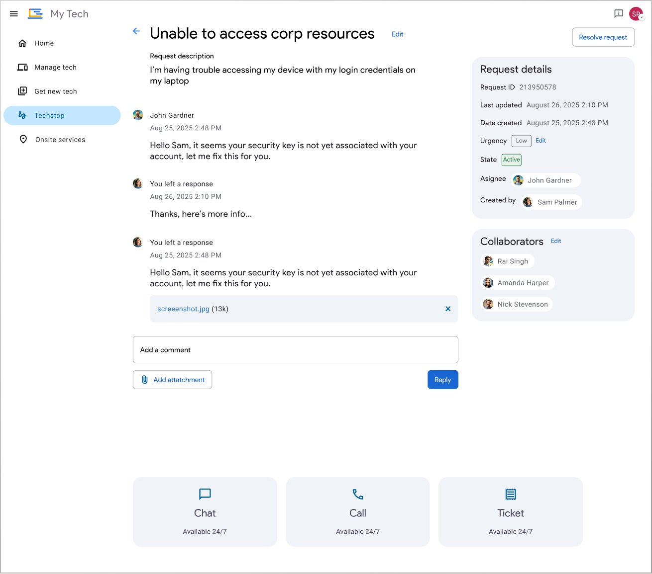
Ticket Tracking & Messaging
Updated ticket information with request tracking, messaging, and various support channels.
Measurable Outcomes
Legacy Platform Migration
ImpactReduced support ticket volume through self-service discovery, decreased task completion time for hardware requests, and unified internal employee tooling into a single design ecosystem.
Employee FeedbackHigher self-service resolution rates among internal staff and positive adoption feedback from IT support operations teams for streamlined case intake
Future LearningImplement AI-powered virtual assistant integration within the search interface to predict IT troubleshooting steps based on real-time employee context and device diagnostics.